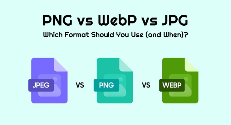
Choosing among PNG, WebP, and JPG/JPEG can feel labyrinthine, yet the payoff is immediate: lighter pages, sharper visuals, and happier users. In this pragmatic, conversational guide, I’ll compare formats, show you swift conversion workflows, and map choices to measurable Core Web Vitals. Expect plain talk with a persuasive edge—because the right file type elevates page speed, trims bandwidth, and fortifies your brand with confident, professional polish.
The Executive Snapshot (Actionable, Not Abstract)
When deadlines bite, you need a verdict you can defend in a stand-up. Prefer WebP for most imagery because it typically delivers smaller files at comparable quality; keep PNG for pixel-perfect UI, line art, and transparency; retain JPG for maximum compatibility across legacy systems. This clear trio keeps LCP lean, improves user experience, and reduces exit rates. Moreover, coupling formats with responsive delivery via a robust CDN is a straightforward way to accelerate both conversions and crawl efficiency.
- Use WebP for photography, banners, and editorial heroes to reduce transfer size.
- Use PNG for logos, icons, and text-heavy graphics requiring lossless compression.
- Use JPG for email, marketplaces, or older CMSs where support is uncompromising.
Understanding the Formats (So Choices Become Inevitable)
Beneath the acronyms lie divergent philosophies of image compression. PNG preserves every pixel with lossless integrity and full alpha channel support. JPG applies lossy compression tuned for natural images, delivering tiny files with acceptable artefacts. WebP fuses the best of both worlds—lossy and lossless—often outclassing JPG at equivalent visual quality and even supporting animation. These differences are not academic; they impact render time, conversion rate, and how search engines interpret site quality signals.
WebP in Practice: The Modern Default
WebP is the nimble all-rounder, typically 25–35% smaller than JPG at the same subjective quality—lovely for Largest Contentful Paint (LCP). Support across modern browsers is strong, and with the HTML <picture> element plus responsive srcset, you can ship next-gen formats with graceful fallbacks. The outcome is elegant: lower bitrate, faster paints, and a calmer dev-ops life. Frankly, it’s the default you choose unless a requirement says otherwise.
- Excellent for product images and campaign creatives; maintain sRGB consistency.
- Mix lossless compression for UI snippets and lossy compression for photos as needed.
- Validate wins with PageSpeed Insights and track field data via CrUX.
PNG in Practice: Precision and Transparency
PNG shines when you demand immaculate fidelity—razor-sharp text, flat-colour UI, or overlays requiring transparent backgrounds. Because it’s lossless, what you export is precisely what users see, which reassures designers and brand managers. Yes, PNGs can be heavier, but for small interface assets, the byte cost is negligible and the legibility is sublime. As a considered tactic, reduce palettes for UI sprites to capture extra savings without compromising crispness.
- Best for logos, icons, charts, and screenshots with fine lines.
- Keep colour predictable with sRGB profiles; avoid accidental shifts.
- Consider indexed-colour PNG for flat artwork to reduce size further.
JPG in Practice: Ubiquitous and Expedient
JPG remains the trusty workhorse for photography, especially in ecosystems that haven’t fully embraced modern formats. With sensible quality factor tuning and progressive JPEG rendering, even large hero images can feel swift. In email templates, CRM systems, or marketplace listings that only accept JPEG uploads, JPG is not a compromise; it is the compatible, commercial choice that keeps operations frictionless and stakeholders serene.
- Ideal for lifestyle photography and catalogue shots in conservative stacks.
- Watch for artefacts around sharp edges; avoid using JPG for text-heavy UI.
- Prefer progressive encoding to improve perceived loading on slow networks.
Performance, SEO & UX: Outcomes You Can Prove
Format selection ripples through Core Web Vitals, engagement, and revenue. Smaller files curb network latency, shorten TTFB-to-paint intervals, and encourage deeper on-page exploration. Search engines reward these outcomes; users simply feel them. Pair the right format with responsive images, edge caching via a CDN, and meticulous metadata hygiene to unlock compounding benefits. Measure, iterate, and document—this is robust, repeatable optimisation rather than guesswork.
- Ship next-gen formats where supported; retain reliable fallbacks.
- Provide descriptive alt text and semantic filenames for better context.
- Audit in lab (Lighthouse) and field (CrUX) for sustained uplift across cohorts.
Semantic SEO Signals: Entities, Tasks, and Attributes
To amplify topical authority, cover entities (formats, browsers, CDNs), tasks (conversion, delivery), and attributes (quality, colour, compression). This holistic network of meaning helps algorithms understand depth, and users appreciate clarity. Sprinkle, naturally, terms like image optimisation, lossy compression, lossless compression, alpha channel, responsive images, CDN, progressive JPEG, quality factor, bitrate, sRGB, EXIF, artefacts, conversion rate, crawl budget, CrUX, and Lighthouse—and let your internal links guide visitors from comparison to action.
- Cross-link comparison pages to workflow pages and to conversion tools for elegant journeys.
- Document thresholds for acceptable quality to sustain consistency at scale.
Step-by-Step Conversion Playbooks (Zero Drama, High Reward)
Adopting a modern format shouldn’t derail your sprint. The following playbooks are deliberately simple, enabling designers, marketers, and engineers to act immediately—no CLI wrestling, just results. You’ll modernise assets, preserve brand fidelity, and verify improvements in minutes. Stakeholders love the clarity; users love the speed; finance loves the bandwidth savings. Win-win-win.
PNG → WebP (Default Modernisation for Real-World Sites)
Migrating PNGs to WebP trims payload while retaining detail, especially for photos and banners. For interface graphics needing hard-edge clarity, keep a PNG source but test lossless WebP too. Use semantic HTML to deliver browser support gracefully, then document size reductions and LCP gains to build a durable internal case. It’s quick, reversible, and frankly, cathartic.
- Open, try this tool to convert images into webp format and upload one or more PNGs.
- Begin with a quality factor near 80; preview closely for halos or banding.
- Export; record file sizes and note percentage reduction for reporting.
- Implement via <picture> with PNG fallback and responsive srcset.
- Re-audit LCP, CLS, and total bytes with PageSpeed Insights.
WebP → JPG (Graceful Compatibility for Legacy Requirements)
Occasionally, a marketplace, email client, or partner portal accepts only JPEG. No melodrama—convert with intention, keep sRGB fidelity, and prefer progressive JPEG for smoother perception on slow networks. This focused workflow prevents last-minute scrambles and preserves design credibility, while keeping stakeholders delighted that everything “just works.”
- Use Webp to JPG image format conversion online tool built by Cloudinary and upload your WebP assets.
- Choose 75–85 for photos; inspect for artefacts around edges and gradients.
- Ensure sRGB profiles; strip non-essential EXIF metadata to save bytes.
- Export as progressive JPEG where supported; version outputs clearly.
- Replace in templates, deploy, and validate via Lighthouse.
Quality & Colour Management Basics (Simple, Durable, Reproducible)
Colour variance and over-compression erode trust quietly, so govern them deliberately. Standardise sRGB as your working space for web delivery to maintain cross-device consistency. Define acceptable quality factor bands for photographs versus UI, and educate teams on visual checks to spot subtle artefacts. Finally, version your masters and automate naming; future-you will be grateful, and audits will become swift and serene.
- Keep a pristine source file; generate delivery variants automatically.
- Store proofs of size reductions to support procurement or finance discussions.
- Revisit thresholds quarterly; technology evolves, so your standards should too.
Pro Tips & Pitfalls (Because Experience Pays Dividends)
Even adept teams trip on the same gremlins. Avoid using JPG for text-heavy UI; guard against PNG bloat on large photos; and never overshoot compression to the point that users notice. Embed responsive images in templates, leverage a capable CDN, and keep governance simple yet firm. A small ritual—preview, measure, document—creates compounding gains across campaigns.
- Descriptive filenames aid both accessibility and discovery in DAMs.
- Set width/height in HTML to stabilise layout and reduce CLS.
- Maintain a living playbook of browser support caveats and fallback rules.
Final Recommendation & Confident CTA (Let’s Ship Faster)
Adopt WebP as the default for photography and banners; keep PNG for transparency and line art; retain JPG for uncompromising compatibility. This triage improves conversion rate, enhances perceived quality, and signals technical excellence to search engines. To act right now—without meetings, scripts, or drama—convert with the tool to convert images into webp format by Cloudinary, and satisfy legacy or distribution constraints with webp to JPG image format conversion online tool built by Cloudinary. It’s efficient, measurable, and, frankly, refreshingly professional—an astute upgrade for teams that value velocity and verve.
Also Read: How to Stream High-Quality Video with VaaS and Enhance Visuals Using Cloudinary’s Image Upscale